
Thank you very much to everyone who’s voted and commented on the direction of our new brand.
We’re delighted to share our final decision, which you can see by scrolling through the images below.
It’s exciting to finally have an identity and for Good Ways to start growing in character.
It has been an iterative process and receiving feedback and opinions from members and external experts has helped us start developing an identity that is accessible, inclusive and joyful.
Click on images to enlarge them


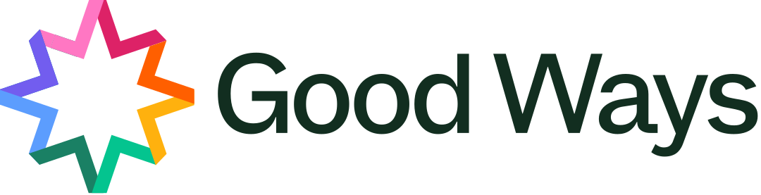
Our logo is the Guiding Star, the main font is Atkinson Hyperlegible Next and colours the IBM Extended option – choices that the majority of members voted and gave strong reasons for.
In our previous update we asked about colours of lines on maps. We really appreciated all of the comments and have decided to go with the simple purple for now. We can test that on the new app and see how it goes. As Good Ways develops we can test additional colours, styles and options that make it easier to browse and choose routes. I loved the idea of being able to choose our own route colours.
There is lots more work to be done on how Good Ways looks and feels, but this is a cracking start that we’re very proud of.
What do you think?
I can’t wait to sew a Good Ways patch onto my bag!
Got any ideas for how we should develop or promote our new identity? Let us know below.
Thanks again.
And thanks very much to Anton, our brilliant designer who’s made all the magic happen.


Leave a Reply
You must be logged in to post a comment.