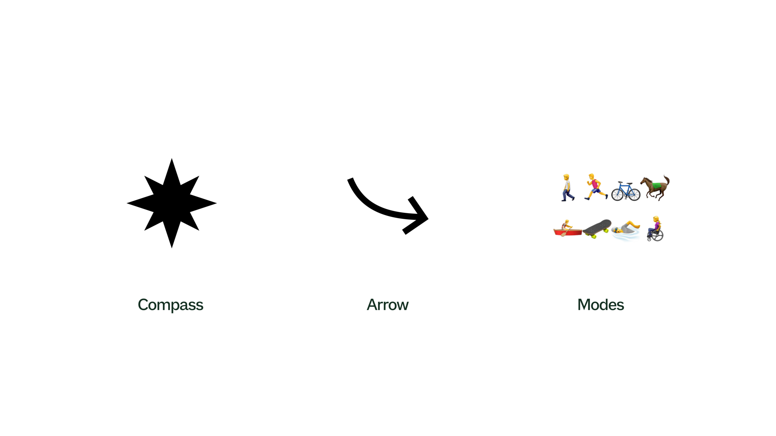
White slide showing three elements across the center: a black compass star labelled "Compass", a curved black arrow labelled "Arrow", and small activity icons labelled "Modes" showing walking, running, cycling, horse riding, paddling, skateboarding, swimming and wheelchair use.

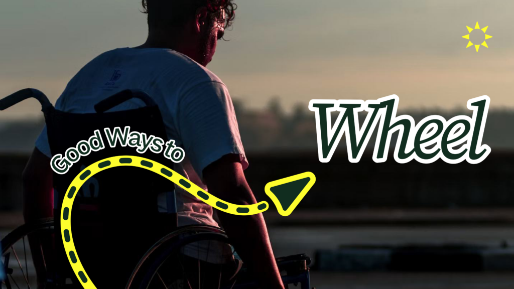
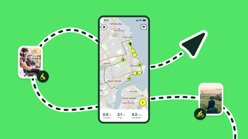
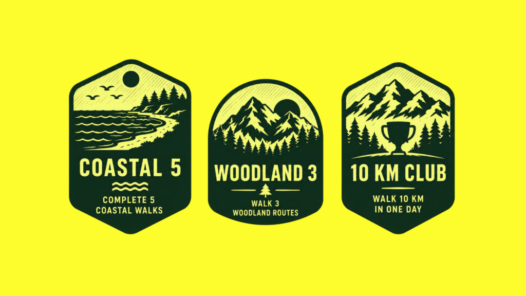
Update 5: We’ve no logo! Which of these identities should we choose for Good Ways?

Good Ways is so new we’ve not even got a brand yet.

We’ve not got a logo, colours, choice of font, photo-style or an identity. Choosing these will shape our future relationships and success.

Anton, our designer, has been working on lots of possibilities.

We’ve narrowed them down into two initial concepts and would like to know which you prefer and think we should develop further.

Take a look and let us know by voting and commenting below.

First, share your vote. Which do you prefer?

Next, we’d love to know what you like and dislike about the two approaches. Share your thoughts by commenting below.

We can’t wait to see your feedback.


Comments

28 responses to “Update 5: We’ve no logo! Which of these identities should we choose for Good Ways?”

  1. Paul Chilcott avatar
    Paul Chilcott

    I prefer the guiding star of the two, but I would prefer the chevrons to be tapered so that they come together at a sharp point in the star – I think this would be easier on the eye.

  2. Edmund WHELDON avatar
    Edmund WHELDON

    To many arrows out there already GS for me in a fluorescent colour so it stands out and iced.

    1. Edmund WHELDON avatar
      Edmund WHELDON

      Noticed

  3. Andrew Mackay avatar
    Andrew Mackay

    I prefer the guiding star – combination of the joy that the colours represent, and connections between. I think, although the ‘radiating’ nature of radiating joy seems nice, it could easily get lost amongst logos. It doesn’t symbolise routes or connections between places as well as the guiding star. Also, I feel guiding star does symbolise something that is carried from Slow Ways somehow, maybe it’s the different colours from the overview maps and main webpage. Struggling to come up with negatives, maybe too complex and might present colour accessibility issues on certain backgrounds, but this could be resolved with simplifying in certain contexts.

  4. Deb Tortoise avatar
    Deb Tortoise

    I agree with everything in Ian Thomas’s comment on 5th June.
    Plus, the arrow in Guiding star immediately made me think of Amazon.

  5. porcovolente avatar
    porcovolente

    I like the typography and design of the Guiding Star format but prefer the logo of Navigating Joy (not necessarily in yellow) which I think is less fussy.

    1. Sue Hilder avatar
      Sue Hilder

      Agreed. There are already so many logos with multiple colours (I’m thinking UN Sustainability Goals, for one), and linking each colour to a type of activity requires a step of complication that is inelegant. Whilst the Navigating Joy option does make me think of holiday companies, it is clear, simple, and stands out from other (loosely) environmental logos, so I think will be more memorable and recognisable.

  6. MagsLHalliday avatar
    MagsLHalliday

    The NJ reminds me too much of political organizations/branding whereas the GS one feels more inclusive and, ironically, joyous.

  7. Andrew Gray avatar
    Andrew Gray

    Guiding star theme is more ‘comfortable’, easier on the eye and fits better with whole ethos of good ways. Are these really the only two main options? Feels a bit like ‘pick any card’ (but pick the one we want you to pick). But tbh ‘guiding star’ will be hard to beat.

  8. John Bone avatar
    John Bone

    I inadvertently click on Navigating Joy instead of Guiding Star. Remove one vote from NJ and add it to GS. The colours verging on neon/dayglo in the NJ images was too harsh.

  9. Sarah Allen avatar
    Sarah Allen

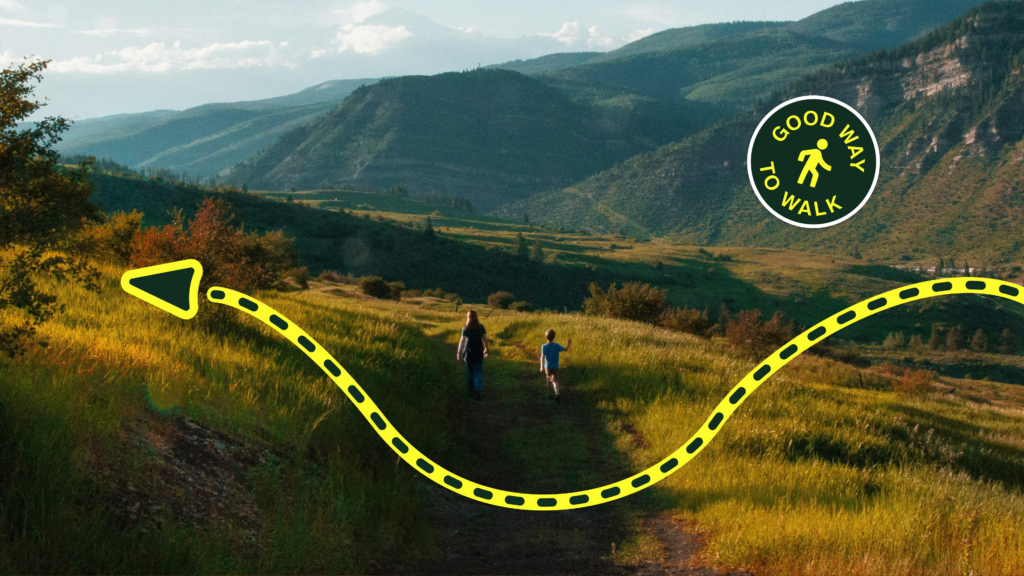
    I find the yellow in 2 a bit jarring and distracting from the rest of the images and purpose. I like how 1 looks in the logo list alongside English Heritage etc and the colour palette really appeals in the ‘awards’.

  10. Bettina E-K avatar
    Bettina E-K

    Guiding star: The colours influenced me; the yellow and black from navigating joy _felt_ aggressive.
    Guiding star is very of the moment with bright rainbow colours, and it projects inclusivity (to me).
    Because it is ‘on trend’, it might date more quickly – but that is a day after tomorrow problem!

  11. Chris Buckley avatar
    Chris Buckley

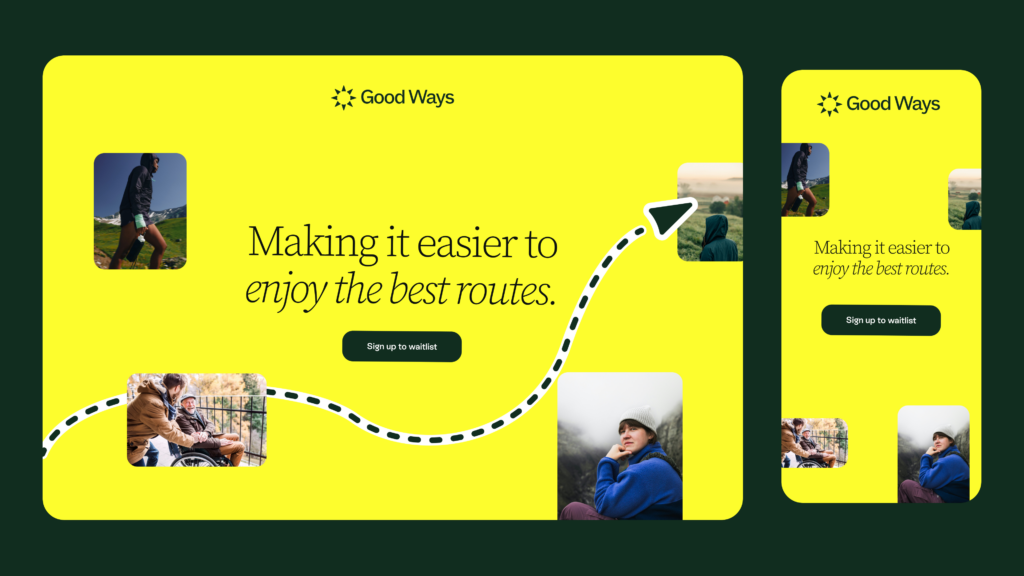
    I think the softer pastel colours of Guiding star are more relaxing and to my mind create the sort of peaceful vibe I hope you are aiming for with the app. Navigating Joy feels much ‘busier’ and to be honest I think I would find using it just too exhausting!

  12. John Donlan avatar
    John Donlan

    Much prefer the multi colours, looks more interesting than the monotone yellow

  13. Graham Mitcheson avatar
    Graham Mitcheson

    Guiding Star was an invitation in
    Navigating Joy was a projection out

    Guiding Star made me feel like I was joining something
    Navigating Joy felt like I was being sold something

  14. Emma Welton avatar
    Emma Welton

    I find the guiding star more characterful and suggestive of the many ‘good’ ways there are. By contrast, I find other is a bit bland despite the lovely yellow. I wonder whether the guiding star could be a little more compass-like. But it’s probably not necessary.

  15. Naomi Wrighton avatar
    Naomi Wrighton

    I like the Joy one as it stands out more. The colours on the other are clever, but would people get the significance?

  16. Shona Goulds avatar
    Shona Goulds

    It’s Guiding Star for me: the colour coding of the different modes appeals to me. Simple but stands out, in an understated way, from the other mono-coloured brands.

  17. Windy ridge avatar
    Windy ridge

    The arrow in the first one is too similar to Amazon. The group of methods of travel is too small to make an impact and new ways may yet emerge.

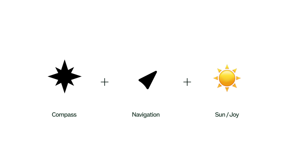
    On the other hand a compass, a navigation arrow and the sun say it all: outside and travelling in a direction that, in this case, others have worked out for the greater benefit

  18. Ian Thomas avatar
    Ian Thomas

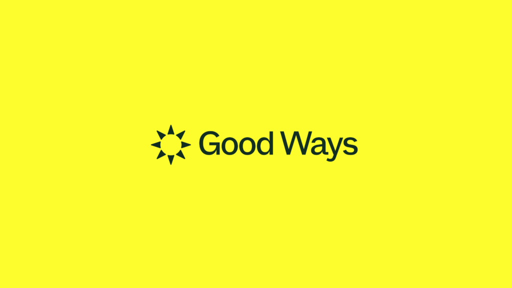
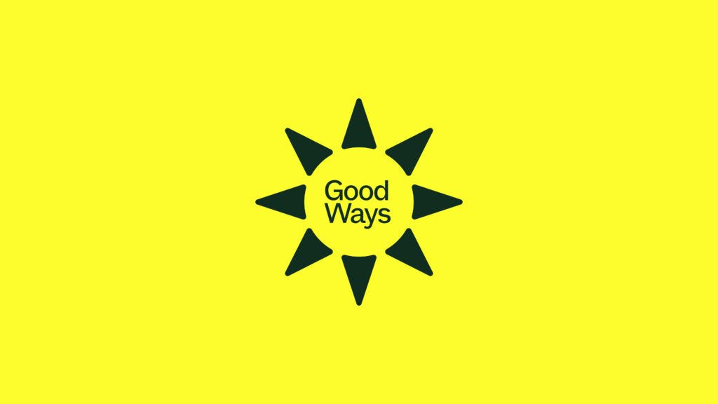
    The navigating joy route is the strongest in terms of its branding presence. The contrast of the yellow brandmark works really well on a photo or colour background. The choice of a single colour is confident and reassuring. Yellow is a warm and positive primary colour and the minimal range of secondary colours supports it. For me, it’s the only brandmark that alludes to ways and the cardinal points offer a foundation for a visual language that can develop. The guiding star route is anonymous when used on its own. And while the use of different colours may be intended to express ideas like ‘all walks of life’s or ways to go, it lacks the conviction of route one. Both routes are much too close in their application of typography to the British Pilgrimage Trust which is certainly an adjacent organisation so I’d strongly recommend considering alternative typefaces and styles. I think that’s all from me. But what do I know? I’m just a brand consultant 😂

    1. Sue Hilder avatar
      Sue Hilder

      You said it better than I could!!

  19. Paul Watkins avatar
    Paul Watkins

    Yellow and black seemed too bright.

  20. Ingrina Shieh avatar
    Ingrina Shieh

    Love how the concepts have translated into the two different styles! I would lean towards guiding star as it feels closer to what I’m associating Good Ways with – finding different types of good routes. Navigating joy has a nice play on the sun and compass, but I think the sun symbol is a bit too strong and takes away from the navigational/route part of it. Curious about the suggestions made by Jonathan F on having the arrows point outwards, as this is what is nice about the Navigating Joy logo! If you do try the double lined arrows, that element can also be added to images starting from 10 – an additional line outlining the shape with the ‘Run’ text.

  21. Menah Raven-Ellison avatar
    Menah Raven-Ellison

    I really like the guiding star. The font is clear to read and in my opinion, the combination of this with the different colours featured in the star feels iconic and has gravitas. It reminds me of other iconic logos such as the Olympics.

    The colours of the star could be seen as too close a nod to DEI which might be a problem for some!

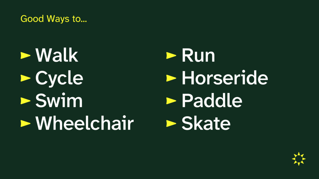
    Love how the chevrons look in the other images as bullet points and as markers of different modes of travel. I can imagine these would animate really well, to show movement and progress, before reforming as a star.

  22. Pat Akerman avatar
    Pat Akerman

    Guiding star looks clean and professional. The yellow against the black on navigating joy is too much of a contrast and either glares at you or gets lost on the page depending on what you’re looking at.

  23. Colin avatar
    Colin

    The yellow star reminds me of a weather map sun symbol not a star.

  24. Jonathan F avatar
    Jonathan F

    Arrows are good. I prefer the first ‘open’ ones over the second ‘filled’ ones, however it feels wrong having each colour point to the centre – please rework this image so each colour points outwards. https://goodways.org/wp-content/uploads/2026/06/guiding-star-page-09-1024×576.png
    That said, I feel there’s also an advantage to having a single colour or b/w logo as there’s then no limit of 8 ‘highlighted modes’ or a bunfight as people push for their mode or term to be one of the 8.
    I hope you’ll also consider using a single line with two arrowheads rather than the 8 arrowheads layout. This would convey the route aspect, and could be formed to represent a smile, perhaps with o o (from good ways) as eyes.
    Good luck!

  25. claremockridge avatar
    claremockridge

    The yellow is overly bold and very contrasty against the black. I recoiled involuntarily from the yellowest images in the set, though it is great used as a strong directional colour line. The varicoloured star is gentler and implies different people with different reasons for using the platform, even though that is a fairly obvious pointer. It’s greatest strength for me though, is that it sits happily among the other logos and looks somehow as if it has always been there, and thus might be safely appealing to potential new users. Anyway, I feel like I’d perhaps have liked to see something in between these two as they are chalk and cheese and it makes my vote choice a no-brainer

Leave a Reply