Update 6: Help decide our colours and typography

A big thank you to everyone who voted on our logo in the previous post.

We’ve read through all the comments and are especially grateful to everyone who took the time to give us detailed feedback.

We have decided to go with the Guiding Star logo. 79% of voters preferred this design and we love it.

We think it’s a strong, dynamic and can’t wait to start being creative with it. It’s also a memorable symbol that looks good alongside more established organisations.

That all said, there were some great suggestions on how Guiding Star could be improved including ideas on how chevrons could be redirected, so don’t be surprised if you see some alternative versions and shapes at some point.

For the 1 in 5 who voted for the Navigating Joy logo – we loved it as an option too. Thank you for voting and standing up for it.

We now need to choose a font for our logo, a font for our text and our brand colours and would love to know your opinions on some choices.

Our priorities are to be accessible, readable, versatile and enjoyable.

The proposed fonts have been chosen because they have been designed to be accessible and easy to read. The colour palettes are ones that have been designed specifically for people with colour blindness.

Ready to vote!?

First, we need to choose a font for our logo.

You can click on the images below to enlarge them.

Next, here are three options for our main font.

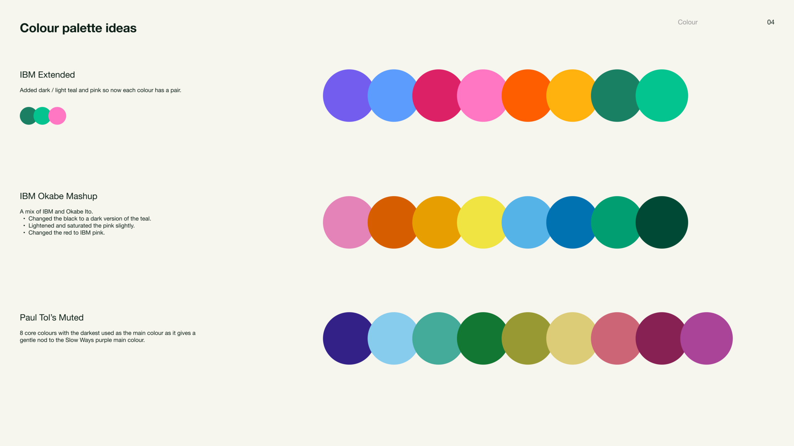
And now take a look at these colour palette ideas.

Finally, we’d love to know what you are thinking.

What do you like? What don’t you like? Should we be considering something else? Please comment below.

Thanks very much. I can’t wait to land on our final brand!


Comments

13 responses to “Update 6: Help decide our colours and typography”

  1. James Waghorn avatar
    James Waghorn

    Outfit Customised gave a clearer arrow head on the G, so got my vote. I so wanted to choose Paul Tol’s muted, because this beautiful world is rarely primary, but I didn’t feel it provided the full joy and contrast needed – so IBM Extended took the tick. As others have said, thank you for the inclusion.

  2. Mary Austin avatar
    Mary Austin

    Paul Tol’s Muted made me think of countryside colours, which I like, although perhaps we do need stuff to stand out more and have a wide range of shades in which case I’d go for IBM Extended. I’m very happy that you’re taking various types of accessibility into account from the start.

  3. Antony avatar
    Antony

    As a dyslexic who reads by word shape not by the letters, the fonts looked the same. There was a different G and one was darker. As long as they’re sans and not with serif it’s good.
    I went for colour contrast. I liked the muted palette but couldn’t see the edges of the colours when butted together (yes, shape again). I went for the simplest pallette, although the yellow on white paper was not clear. Please don’t use the yellow for writing or fine lines, I would not be able to read it on white paper.

  4. Andrew Staplehurst avatar
    Andrew Staplehurst

    I didn’t like the curvy G (looked a bit like a bottom!). I also thought that the customised chevron designs looked a bit clumsy. The Atkinson looked better all round in my view.

    I thought that the Okabe pallet was a better spread of colours (you’ve got to have yellow!). I didn’t think that the muted pallet worked at all.

  5. Sue Burt avatar
    Sue Burt

    Liked the crisp readability of colour and shape

  6. Shona Goulds avatar
    Shona Goulds

    Apologies pasted into wrong section! So as you know it’s me: All good options – tricky choices. Happy with most of them, really. Neat idea including the chevron into letter ‘G’. Appreciate being involved in such as easy accessible way. Thank you. Link to Slow Ways good idea.

  7. Jane Taylor avatar
    Jane Taylor

    For the logo I actually preferred the Strichpunkt non customised. It’s a very cute G!

  8. Philippa Arthan avatar
    Philippa Arthan

    I too like the arrow look in on the capital G

  9. Sue Hilder avatar
    Sue Hilder

    Just re the fonts, I love the ‘quirkiness’ of the ES Rebond Grotesque, but the fact that the first and last options have a ‘hidden’ arrow in the capital G seems too good an opportunity to miss.

  10. Phil Tandy avatar
    Phil Tandy

    All look good!

  11. Phil Tandy avatar
    Phil Tandy

    No further thoughts right now!

  12. Sally Lever avatar
    Sally Lever

    thanks for the inclusivity

  13. Sally Lever avatar
    Sally Lever

    No further thoughts at present.

Leave a Reply